Sociedad Groove – Instagram Rebrand
01 — Role
Instagram visual direction & rollout
Visual assets (flyers, grid visuals, photos) were created by a graphic designer and photographer based on the guidelines I defined. Visuals are in English to address an international audience, while most post descriptions and stories are written in Spanish for the local community.
02 — Goal
Make the Instagram profile look consistent and intentional, so it feels like a recognisable music project rather than a collection of one-off posts.
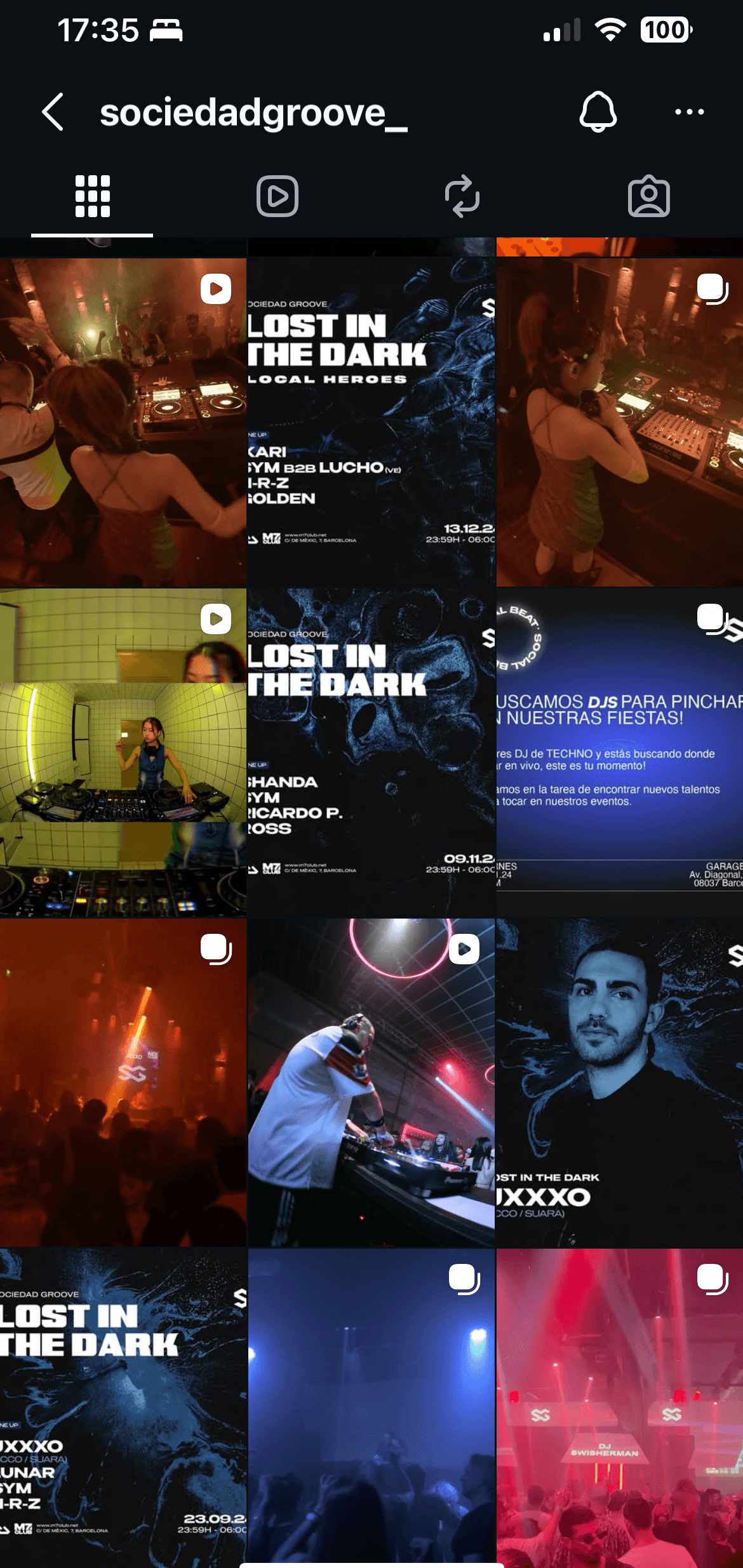
Before
The grid looked messy: inconsistent colours, no clear structure, and no visual identity tying posts together.
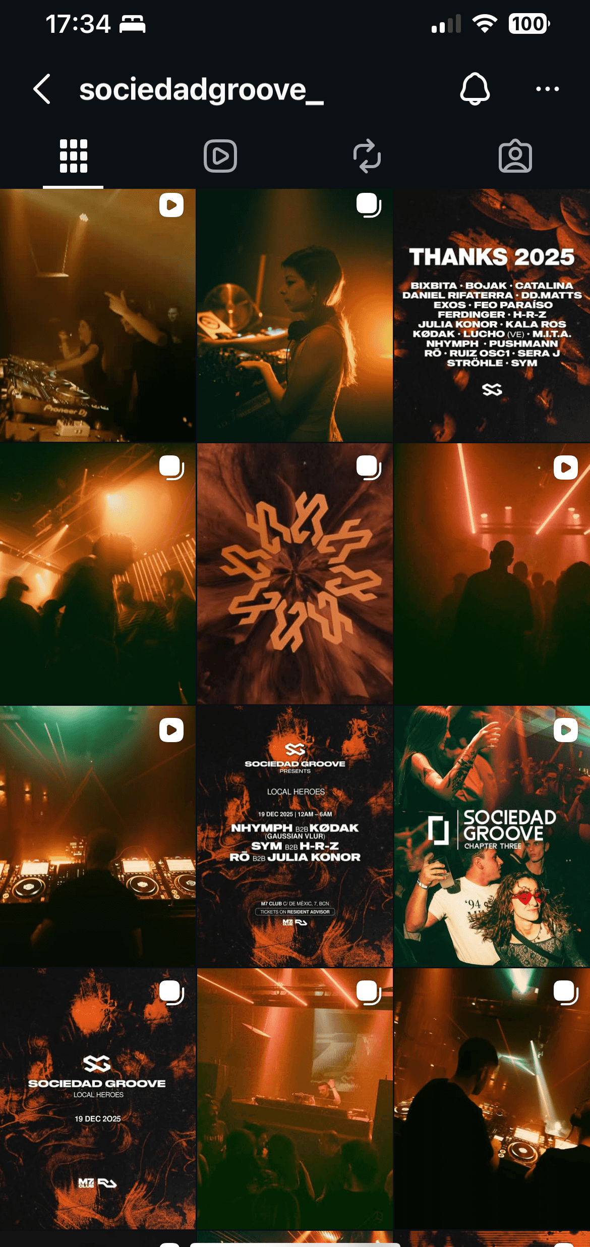
After
Created a simple, repeatable visual system so every post supports the brand, not just the event.
04 — What I did
Defined a consistent colour palette for posts and stories
Set grid logic (how different post types appear and repeat)
Wrote a simple set of visual guidelines for the project
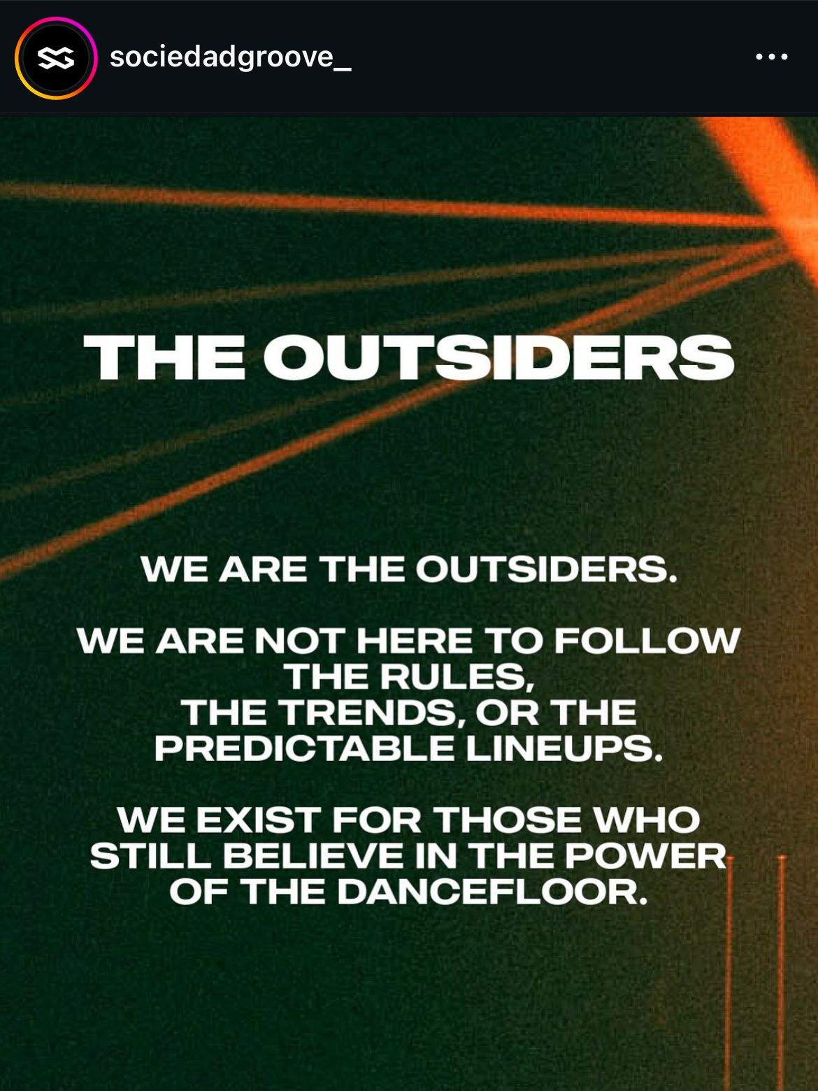
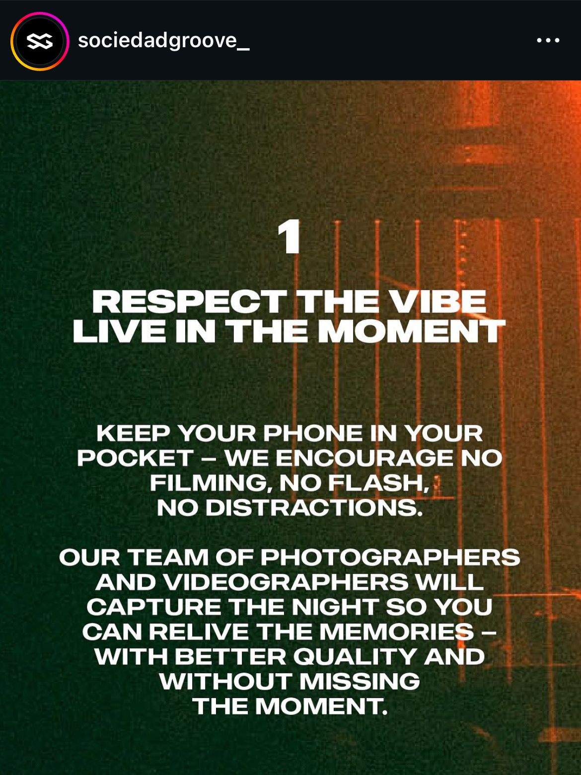
Created 3 pinned posts to introduce the project and its identity
Defined basic brand values and tone of voice to guide future posts
Briefed and coordinated with a graphic designer and photographer
Applied the new visual system across posts and stories using their assets
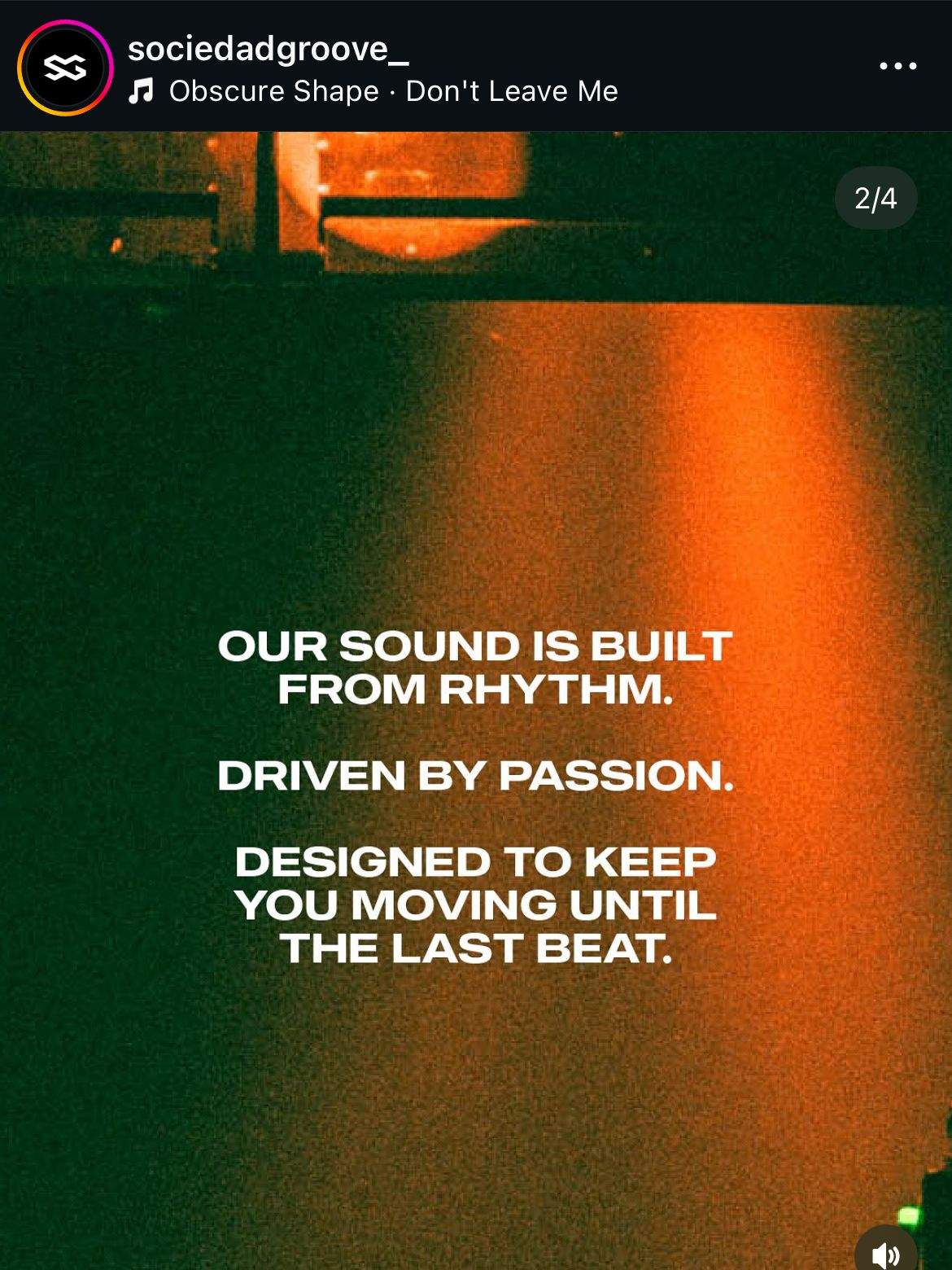
Pinned Posts Introducing The New Identity and Launching The New Instagram Look
05 — Results
Clear before/after improvement in grid consistency
Easier to recognise Sociedad Groove posts at a glance
A layout that supports future campaigns, announcements, and lineups
06 — What this shows
I can think beyond single posts and design a usable visual system for ongoing, bilingual event promotion, working with designers and photographers to keep everything aligned.